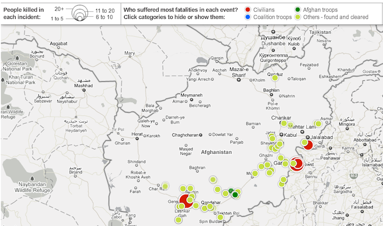
Two maps showing the 300 most significant leaked memos, on the wars in Iraq and Afghanistan.
Yesterday, WikiLeaks scored one of the biggest scoops in its young life: over 90,000 raw field reports from the war in Afghanistan. And to coincide with that leak, the Guardian has created the most useful tool out there for deciding for yourself what the memos mean.
After reading all 90,000 memos, the Guardian's editors created two maps: One, shown above, that shows only the 300 key incidents revealed in the war reports; and another time-lapse animation that shows IED attacks in between 2004-2009.

Maybe the most explosive charge contained in the first map is that the U.S. military knows that Pakistan has been helping the Taliban with both funding and war strategy--meaning that Pakistan is playing a direct role in killing American soldiers. Many have pointed out that this isn't quite news--the Pakistan/Taliban link has been frequently reported in the media. And the military itself is saying the memos pose no threat to national security. But there's a step-wise difference in getting such info from shadowy anonymous sources--and directly from the U.S. military's own intelligence. The latter paints a very grim picture of the war.
Maybe this stuff isn't new, but probably never before in history have citizens been given such direct access to the military's own understanding of the war it's fighting. And this tool is all you need to dive in.
all the top scoops [Infographic]
Wikileaks: a timeline of the site's top scoops The whistleblowing website Wikileaks has released a document containing reports from 90,000 incidents in the Afghanistan war. Here's an infographic showing some of the other top scoops released on the site. Link to Infographic
